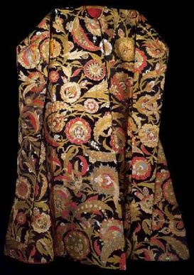
 This masterwork of silk does not repeat the pattern in the entire garment.
 Commonly used plant dyes (with mordants of alum, iron, tin, or copper) were indigo for blues; madder for reds and oranges on wool; weld, safflower, larkspur and saffron were used for oranges and yellows; certain types of buckthorn berries gave green; and brazilwood gave purplish red. Insect based dyes such as kermes, lac, and Mexican cochineal produced the most vibrant and valuable reds and crimsons.
Additional colors were produced by overdyeing one color with another. A yellow dye over indigo gave greens, indigo and henna produced blacks and indigo with a crimson dye produced deep purples.*
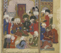
 Late 16th Cent Ottoman Painting. (Photo credit British Museum)
 Some personal things that I keep in mind when making color choices for an Ottoman persona:
- If I were to create a garment for someone of high status I would plan to use a rich crimson at least somewhere in the costume, if at all possible.
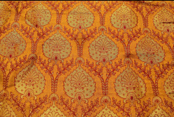
- If I have fabric woven with metal threads (such as the Indian jacquard in the below photo) I would also use it only for someone of high status, as serasar was only available to the very wealthy.
- I always use white for the gomlek (this is all I have seen in paintings, though there is one that could possibly be interpreted as indigo), but it is good to keep in mind that white is also an option for a woman's pants.
- If I were to create the impression of a non-upper class person, I would lean towards oranges or orange-reds rather than crimson or blue-based reds for color choice in the red family.
- A well-chosen, rich color in a solid fabric (such as a velvet or satin) can read better as a period reproduction than an overly busy quilting cotton that employs far too many colors. (Often I will use a solid for a coat and reserve that lovely, but busy print for the pants.)
- While deep or bright colors were highly prized and more prevalent, there were also Imperial garments in white or pale shades such as taupe or rose.
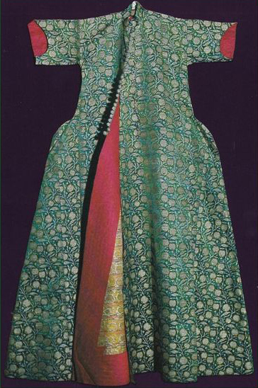
- The facing of the coat was often a contrasting color (as shown in the green Imperial caftan below). I have seen red, yellow, light blue, olive, bright turquoise, rust, grey, or hot pink, with other hues possible as well. The lining of the garment could be a plain white (or beige) linen or cotton, or could be colored fabric as well.
- Typically somber colors such as the darkest blues, black and dark greys were used for mourning, modesty or to show one's piety.
- When looking to patterned fabrics, I try (though it is not always possible) to pick textiles that have a few colors, but not too many (again, that can be a failing of modern quilting cottons when used for recreating historic costume). Often striking patterns were achieved with only two colors. For more colors at once, a popular color combination for brocades was red/yellow/blue or red/yellow/blue/white. Red was the predominant color, with yellow (or gold metal) following that and small accents or outlines in blue or blue/white.
- As always, I never knock the idea of using anything at least semi-appropriate that is already dwelling in the fabric stash. :-)
For a selection of both extant textiles and extant art, please visit my Pinterest page to see further examples of the amazing range of colors used for Ottoman silks.
http://pinterest.com/alfrunketta/ottoman-and-middle-eastern-costume/


 RSS Feed